Slap
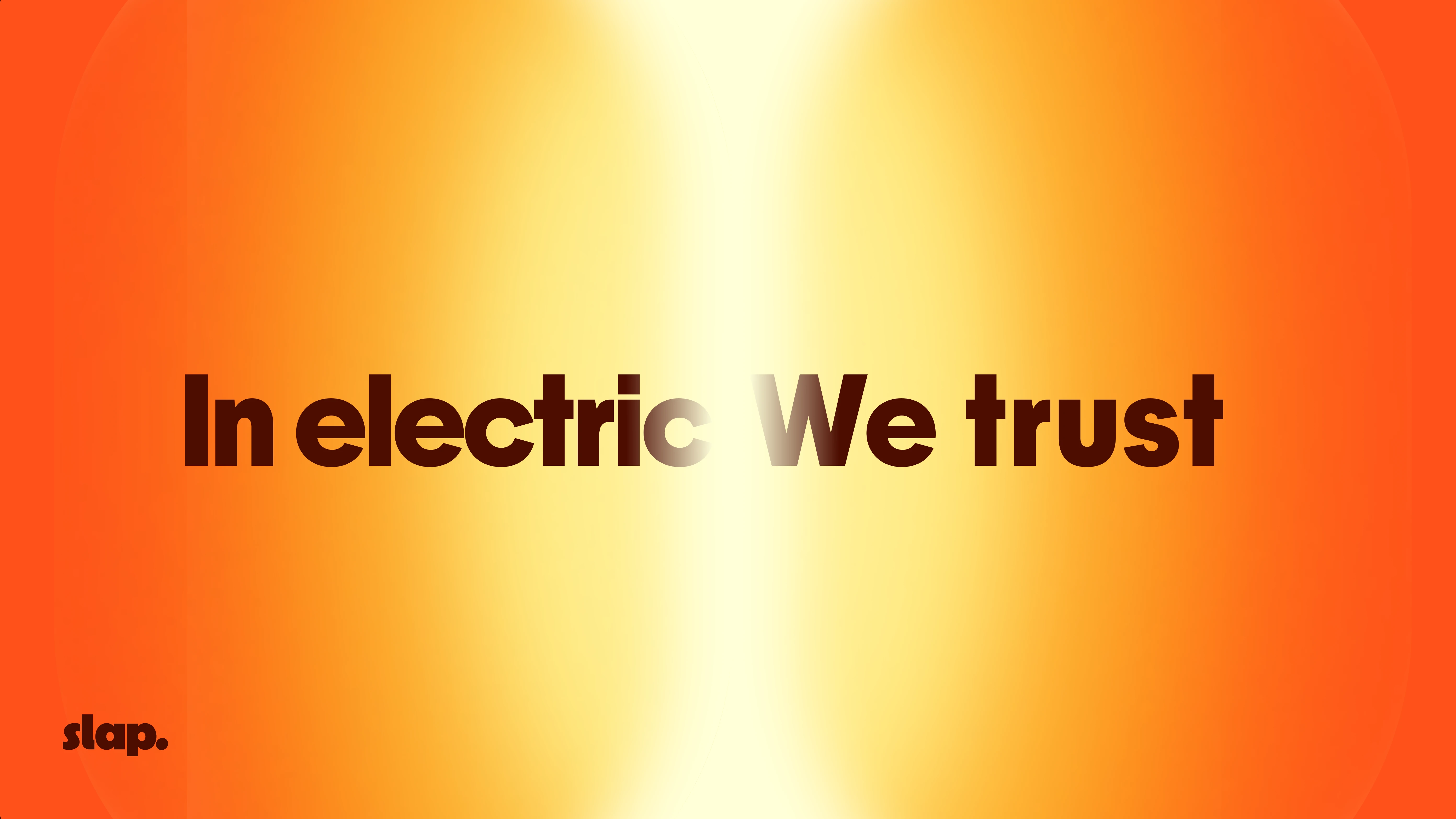
In electric we trust
Year
2026
industry
Klimb Agency

Project Overview
Slap is a brand project fully dedicated to electric mobility. Its mission is simple: accelerate the shift towards cleaner transportation by breaking away from the overly predictable codes of the industry.
For the visual identity, I wanted to move against the usual clichés where electric mobility is almost always tied to blue, green, or yellow tones. Instead, I built the art direction around a bold orange palette and a “sunrise gradient”. Inspired by the feeling of a sunrise, this colour direction symbolises renewal, the beginning of a new era for transport, and a sense of raw energy.
To balance the strength of that palette and let the concept breathe properly, the logo takes a more minimal approach. It’s built around a modern Sans-Serif typeface, intentionally clean and understated, anchoring Slap in a world that feels bold, refined, and memorable.
Deliverables
Webdesign
Illustration
Photography
Front development (Webflow)