
Welcome to my hall of fame


Arch
Arch provides a comprehensive and guilt-free ecosystem for parents, supporting families from early childhood all the way to financial stability. To reflect this dual mission, the design combines trustworthy tones with an energetic green and a four-arch logo built around a central star.


Slap
Dedicated to accelerating the shift toward clean transportation, Slap deliberately breaks away from the predictable, cold visual codes of the electric mobility industry. Fusing a bold orange sunrise gradient with an understated minimal logo, the resulting art direction trades generic eco-clichés for raw energy and refined renewal.

Evocae
Aiming to remove the heavy anxiety surrounding post-high school orientation, Evocae turns the pressure of the perfect choice into a journey of positive exploration. By reinterpreting the classic compass symbol and introducing warm, optimistic gradients, the new identity completely breaks away from cold institutional design to build a comforting universe full of possibilities.


Mik plus
Born from a complete refusal to fit into the mould, Mik Plus translates a personal drive for non-conformity into a high-ambition brand ecosystem. The visual direction uses the codes of the sky and space to represent this constant push to aim higher, delivering a self-built project mastered entirely from initial brand strategy to final code.

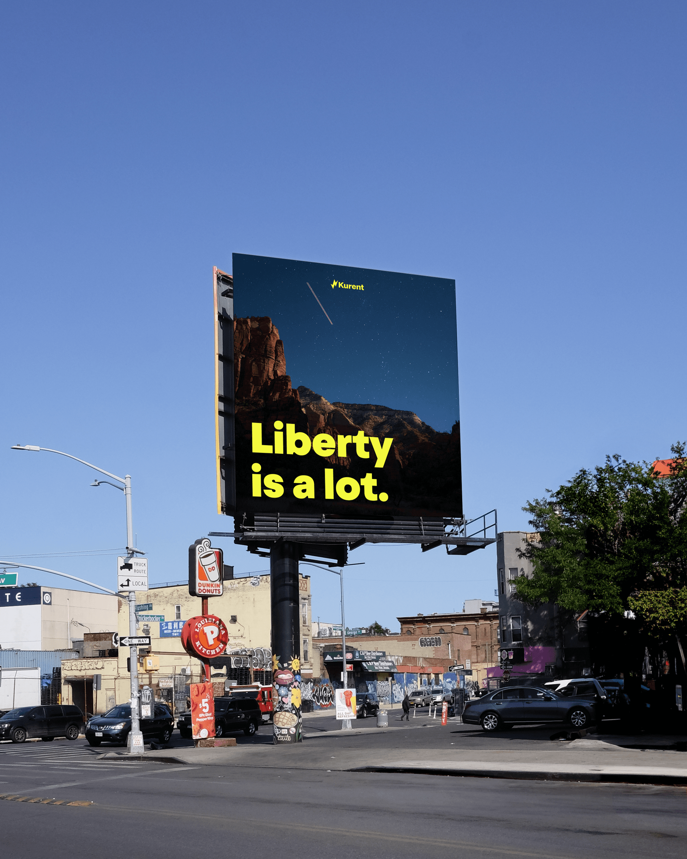
Kurent
Designed to shift the focus from car ownership to absolute freedom, Kurent makes flexible mobility feel completely seamless. I anchored the visual identity around a stylized lightning bolt as a starting point, delivering a bold and original message without going over the top.

Rakana
Promoting Caribbean tourism through pure cultural authenticity required moving away from generic tropical clichés. This led to the creation of Rakana, an identity entirely built around a native Arawak word to establish a deep historical link that highlights the true essence of the region.


Opera de lille
The core ambition behind the Opéra de Lille rebranding was to break down the elitist stereotypes of classical theater to attract a younger audience. The new visual identity acts as a direct bridge between tradition and modernity, fusing institutional prestige with contemporary cultural codes.

